Start with a familiar, one-prompt AI website. Keep the fictional business. Rethink just about everything else.
A STAGED EXERCISE NOT A REAL CLIENT ENGAGEMENT
01 / THE TRANSFORMATION
Same brief. Different impression.
ORIGINAL AI BASELINEDRAG THE DIVIDER OR USE ARROW KEYS THE CUSTOM RESCUE
01 / BEFORE
02 / AFTER
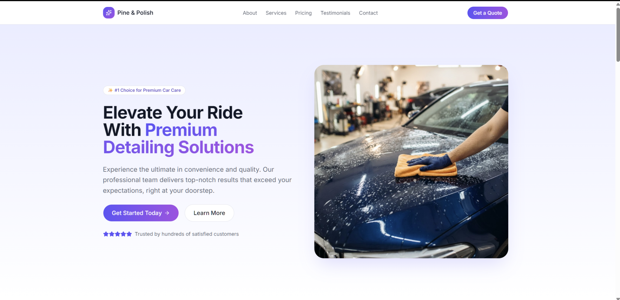
THE STARTING POINT / 01 Generic gradients, forgettable copy, repetitive service cards, and testimonials invented by a generator.
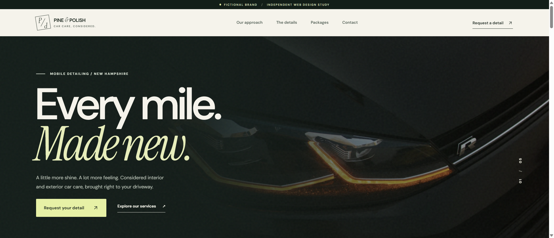
THE REBUILD / 02 A distinct identity, specific car-care offerings, a more purposeful layout, and a quote flow that explains exactly what it does.
Move the divider to compare actual screenshots of the original and the new codebase. This is a staged design exercise for a fictional business—not a claim about a real client.
02 / WHAT CHANGED
Less AI slop. More intention.
01 / 04
From a template to a point of view.
The original used predictable purple gradients, repeated white cards, rounded buttons, and generic corporate copy. We built a fresh editorial identity with pine green, warm ivory, expressive type, and automotive imagery that does the talking.
02 / 04
From services to decisions.
We rewrote the service descriptions around what people actually care about, separated care options into a clearer package menu, and designed more thoughtful paths to the quote experience.
03 / 04
From fake proof to real transparency.
The generated baseline claimed it was a “#1 choice” trusted by hundreds of customers and included invented five-star testimonials. Those claims are gone. The demo openly identifies the business, photography, and prices as fictional.
04 / 04
From a dead end to a working demonstration.
The starter form said a request was received even though it was never delivered. Our replacement validates the visitor’s details and shows a reviewable request preview—without pretending it sent or saved information.
03 / THE SMALL SCREEN
Designed for real thumbs.
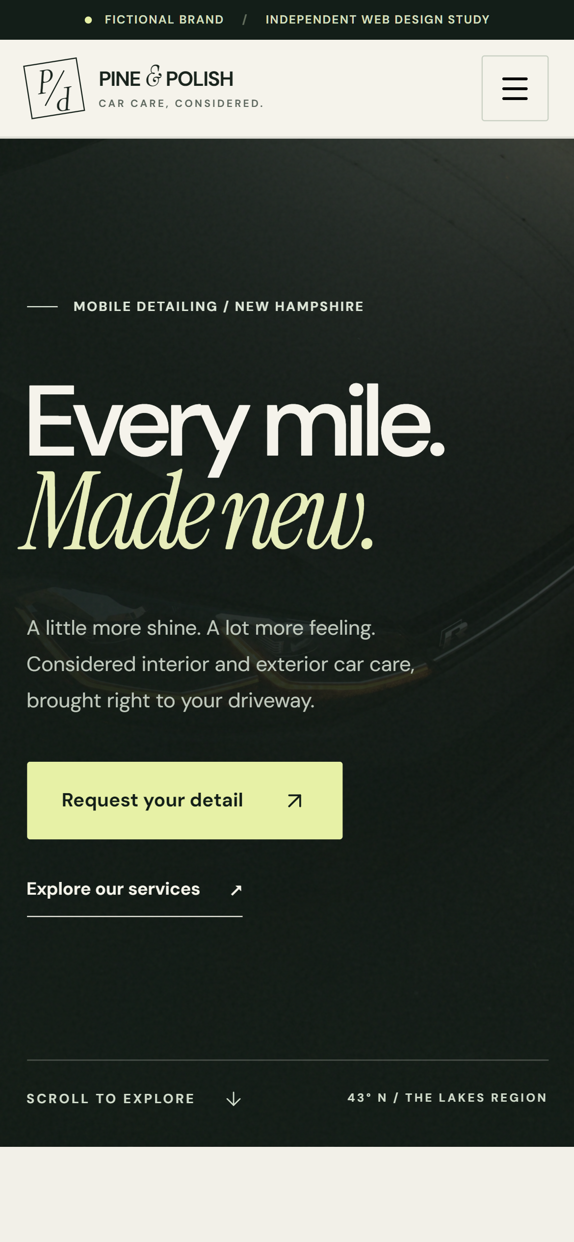
A beautiful desktop hero is not the whole job. The mobile version needs readable copy, clear navigation, sensible tap targets, and a usable way to request a detail.
At 390px we tested the menu, navigation, form validation, package selection, and the accurate request-summary state. No horizontal overflow.
Pine & Polish is a fictional concept used for a staged design demonstration. No real clients, bookings, reviews, ratings, conversion results, or project revenue are represented. Photos are illustrative stock imagery.